We’ve all been there… laboriously trying to zoom in on small screens, straining our eyes to read tiny fonts, and scrolling around a web page both horizontally and vertically, all in an attempt to complete some type of task, research or transaction on an outdated website using our smartphones. It’s a frustrating experience to say the least.
These clunky websites that haven’t adopted modern day best practices are committing a major digital faux pas. They are not leveraging what’s called a “responsive design”—and this is a major reason why they aren’t mobile-friendly.
If you’re curious, here’s a succinct explanation of how responsive design works. But the key point is that responsive websites and applications adapt to a user’s screen/browser size and resolution by automatically scaling and reorganizing page layouts and content to accommodate differences from a traditional desktop view.
In the world of Continuing Education, “going mobile” has become very important over the past few years. Mobile learning was first popularized in the corporate eLearning space, but as participation in online CE courses continues to climb, the usage of mobile devices to complete these courses has increased as well. Perform a simple Google search on mobile apps for Continuing Education and you’ll find numerous programs that are catering to this growing audience.
That said, mobile learning is not just a waning trend—the statistics are there to support these shifts. Seventy percent of learners report feeling more motivated when they train on a mobile device, and smartphone users complete course material 45 percent faster than those on a computer. Even if you know that the vast majority of your CE customer base is taking courses on a desktop or laptop, it’s best to ensure your content is mobile-friendly now before it’s too late.
Below, we share eight tips that will help your organization provide a better user experience for eLearners participating in your Continuing Education program via their mobile devices.
1. Leverage an LMS or Content Delivery Platform Built With Mobile in Mind
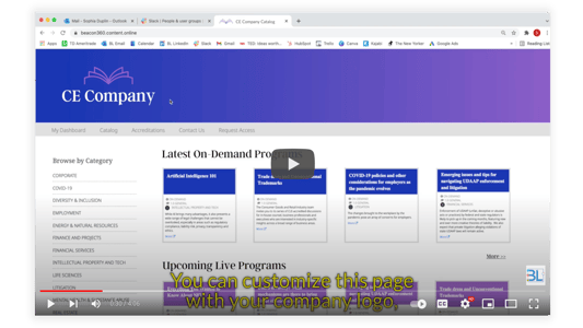
First and foremost, if you’re going to take mobile learning seriously, it’s critical that you partner with a Continuing Education solutions provider that has developed their platform to specifically be mobile-friendly. Even if the course content itself has been created with mobile in mind, the technology you use to manage that content and deliver it to your eLearning audience must be responsive as well. Otherwise, the platform is going to be difficult to navigate, and you’ll end up with many frustrated program participants. Moreover, do not use tools that still rely on Adobe Flash. This is a big red flag in the virtual event delivery department, as Flash is not compatible with mobile devices—and, consequently, it’s quickly being phased out of all modern websites and applications.
2. Create Content Using a Responsive Authoring Tool
Responsive eLearning authoring tools have become increasingly popular, and for good reason! In a nutshell, they enable content creators to develop mobile-friendly layouts and templates to which eLearning content of all types can be applied. Coupled with (or built into) a mobile-compatible LMS, Continuing Education eLearners are easily able to access educational materials on any smartphone or tablet and consume the content without a problem. Most responsive authoring tools on the market allow users to preview what their content will look like on various devices before publishing, which helps ensure the look and feel of your eLearning course aligns with the desired user experience.
3. Go Bigger and Bolder With Button Design
When participating in a CE course, users have all kinds of interactions with the platform’s interface. From moving on to another module, to clicking on the play controls of a video, to simply completing a test or exam, eLearners will inevitably click on numerous buttons. To make your content more actionable on a mobile device, ensure that buttons appear large and easily clickable, fonts display as clearly as possible, hyperlinks are easily visible, and an appropriate amount of white space is being used to separate calls-to-action from blurbs of text.
Related: 5 Essentials eLearners Should Be Able To Access On Their CE Platform Dashboards
Related: 5 eLearning Trends CE Providers Need to Adopt ASAP
4. Incorporate Microlearning Modules into Your Program
Microlearning modules are made up of short chunks of educational content—typically in a video format that’s about 5-10 minutes in length. Each module focuses on a single learning objective that is meant to deliver a specific learning outcome. And a series of these modules will effectively work together to provide a complete educational experience to an online CE student. One great benefit of microlearning is that it fits in nicely with mobile device delivery. Bite-sized microlearning videos are easy to digest on a smartphone or tablet, and they accommodate on-the-go professionals who seek the convenience of working towards completing CE courses when they may not be at their desk.
5. Enable AMP on Your Website
What is AMP, you ask? AMP is short for Accelerated Mobile Pages. The AMP Project is an open source initiative that enables content publishers to create mobile pages that deliver content almost instantly, which helps to create a more seamless user experience. While there are both pros and cons to the AMP format (it’s essentially a stripped down version of your site’s mobile pages), it helps to eliminate all the bells and whistles (ads, excess java script, etc.) that hamper your website’s load time and overall performance. While this may not apply to the educational content you deliver through your Continuing Education platform, it can certainly help out with getting more mobile users to your website in the first place (for example, if you enable it on your organization’s blog posts).
6. Optimize Images for the Web
Speaking of page load time, mobile learning is more frequently impacted by bandwidth limitations and slower download speeds. Therefore, optimizing your images for the web is going to directly contribute to a better mobile experience. Compress large image files and size them appropriately for the site. And if you’re able to, select “Save for Web” when you have your image opened in a program like Adobe Photoshop and save the file as a PNG or JPG format.
7. Reduce Friction in Your Navigation
Put a little strategic thinking into the setup of the mobile version of your navigation. Is your CE dashboard broken up into sections? Are intended visitor paths clear and intuitive? Can you save space on mobile pages by leveraging a “hamburger” menu? Mobile learners should be able to quickly find what they’re looking for with as little instruction as possible. Try out some user testing to ensure smartphone and tablet users can easily accomplish their eLearning goals on these devices.
8. Include Closed-captioning in Your Virtual Events
Facebook and other content publishers have found that very large amounts (up to 85 percent!) of video views take place with the volume turned off. While this may seem strange at first, this is quite common for mobile users—where audio isn’t always easy to parse out when you’re in a public environment (think coffee shop, co-working space, or other places where people might be working towards their CE credits). Even for laptop users, this can be the case. The solution? Add closed captions to your virtual events! In addition to several other reasons why closed captions should be included in video content, OnDemand webinars, webcasts, etc., mobile learners will appreciate having visual reinforcement of the content their consuming—particularly if they want to turn the volume off or the sound is competing with a noisy background.
Again, mobile learning is not just a trend. It’s a technological movement that all Continuing Education providers should not only be aware of but also participating in. To ensure you aren’t going to lose your mobile audience—or you’d simply like to grow your customer base—start implementing some of the tips we’ve suggested here as soon as possible.
Any other mobile-friendly advice you’d like to share with our readers? Leave a comment below!
.png?height=300&name=CTAS%202022%20(33).png)
.png)
.png?height=300&name=Screenshots%20(18).png)
.png)
%20(1).png)